
Not So Shabby
Brand and Web Design

Project Overview
Brand and web design for a client in the estate/moving sales industry. She has a thriving business and is looking to strengthen her online presence through a new website. Project focused on bringing client’s vision to life through a customized brand and web design as well as preparing the design file and collaborating around developer handoff.
The Problem
Families going through stressful times such as a death in the family or a relocation find it difficult to manage the logistics of the transition themselves and/or find a company they trust to handle it for them. They’re worried about paying for a service that might not be conducted efficiently or transparently.
The Solution
Create a style and design that fosters trust and provides a welcoming experience for users by including personalized content and warm colors/imagery. Ensure company values and testimonials are highlighted in the design.
Background
My client, Not So Shabby, provides estate/moving sales services, and typically works with families who are going through a large transition such as a loss in the family or a relocation. She has active profiles on Facebook, Instagram, Google, and estatesales.net, and is looking to increase her online presence through a website that represents her brand and business.
Not So Shabby also plans to post her upcoming sales on her website as well as on estatesales.net to keep her potential clients and customers informed.
My Role
Brand and Web Designer, Project Manager
Clients' Roles
Provide feedback, develop website
Team
1 Brand and Web Designer
Client: Not So Shabby
2 Developers
Tools
Figma, Adobe Illustrator, Google Suite, Zoom, Jira
Timeline
8 weeks, including onboarding
Design Process
Discover
Define
Ideate
Prototype
Test & Handoff

Discover
Getting to Know the Clients and Business
During the initial consultation, I met with the business owner, Linda and the developer, Dave to discuss their project goals. We agreed that I would design and prepare a Figma file to handoff to Dave for development in WordPress.
Linda was very open to discussing her business goals, operations, and current online presence, which was very helpful when it came time for strategy around written content and prioritizing features. For instance, since her business is local, Linda is very aware of her competitors and was eager to use results from the competitive analysis to inform the design.
Brand Inspiration
My clients were very aligned with the vision (in terms of visual style) for the design. Dave (the developer) provided me with a photo of a sign that Linda (owner of Not So Shabby) uses at her estate sales and they requested to incorporate the colors and aspects of the graphics into the design. I noticed the sign in quite a few photos that Linda sent me over the course of the project, and kept in mind to integrate that theme in order to create a cohesive brand.

Image of Not So Shabby's Sign

Matching Graphic from Adobe Stock
Competitive Analysis
Per client’s request, I analyzed five competitors, highlighting their features, strengths, and areas for improvement. This analysis provided helpful insights, especially around written content. Although most of these websites were informative, I felt that that adding more personalized content (especially photos and graphics) along with warm colors and imagery could foster an even greater sense of trust with users.

-
Strong bio
-
Clear description of how their process works
-
Overall, very thorough website
-
Imagery, graphics, and icons add visual interest
-
Clear navigation


*Certain information from competitors removed from images for use in case study
Define & Ideate
Content Review & Planning
First, I reviewed the initial client consultation notes, the competitive analysis, onboarding questionnaire (where clients answered more questions about their business, target audience, and project goals), social media pages, and Estate Sales Agreement (provided by client). I was able to get a clear picture of the target audience, their goals/pain points, Not So Shabby’s values and processes, and information about the business (bio, contact information).


Competitive Analysis

Information Architecture
Using the information from my content review, I created a diagram for the information architecture, outlining key sections on each page.

Brand Values & Attributes
The brand values of “honesty” & “trustworthiness”, “transparency”, and “focused on your success” were formed from the results of the competitive analysis, onboarding questionnaire, etc. (everything mentioned under the Content Review and Planning phase). I brainstormed and refined these values, and used them to inform the rest of the brand design, including the brand attributes.
Honesty & Trustworthiness
We care about our community and the relationships we form with all of our clients. At Not So Shabby, we take pride in our work and are there for you during the entire process.


Style Direction
The style direction was primarily driven by Not So Shabby’s design vision. They requested that the primary colors from the sign be used along with a similar font and graphic. Since the colors chosen were very bright, I worked on balancing these throughout the design by breaking up larger sections into cards and balancing the bright/bold colors with white and pale blue.

Bright and cheerful colors (along with a warm/welcoming font) were chosen to invite visitors to the website and foster trust and transparency. The images were selected to add vibrancy to the design and compliment the color palette.
Color Palette
Bright colors based on client preferences along with some softer colors for balance.
Primary Colors

Text & Background Colors

Secondary Colors

Typography
Yellowtail for some of the headings was inspired from the font on the sign, per client request. Open Sans, a clean and lightweight font was chosen to balance the loose handwritten look of Yellowtail.


Icons & Graphics
Icons and graphics to fit the bright and welcoming look/feel of the site and communicate the value of the Not So Shabby's services.

Match brand colors
Enhance communication & meaning


Add visual interest
Images
Carefully selected images that reflect both Not So Shabby’s business and brand (studied images from past sales for this information) and of high quality. Included a few images from the client.


Prototype
Mid-Fidelity Wireframes & High-Fidelity Previews
I used the information architecture and brand style guide to create mid-fidelity wireframes and 3 different style previews in high-fidelity to give the clients a feel for the final design. A total of 5 different pages were created were created (desktop and mobile versions).
Homepage - Mid Fidelity

Services Page - Mid Fidelity

Minimalist design. Soft with an occasional pop of color.

Bold & bright design. Clients strongly preferred this option.

Client Feedback: Actions & Reflections
I met with my clients for feedback. They both showed a strong preference for the high-fidelity homepage version with the boldest color combination, and requested that I enlarge the font on the prototype so it was easier for them to read.
Key Features to Help Client Stand Out

Clear headline that addresses clients' potential pain points. Also includes a catchy photo and a clear call to action.
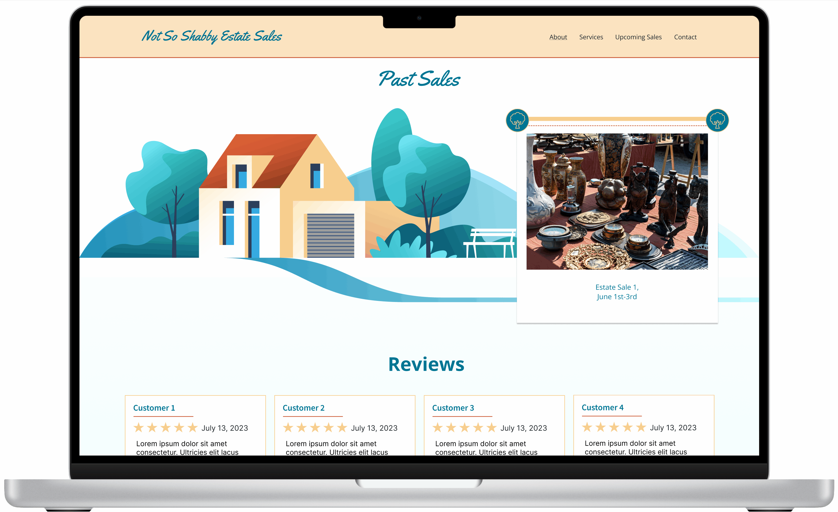
Automatic slideshow with images from past estate sales provide an interactive experience and showcase past work.

Upcoming Sales are highlighted and include the dates, description, and a map (will be embedded on the website).

Client focused values that foster trust and transparency along with testimonials from previous clients.

Services page highlights the free consultation. Header and image make this information easy to find.

Friendly invitation to reach out on contact page. Visitors can fill out a quick online form, call, or email Not So Shabby.
Mobile Version


Test & Handoff
Let's Get Into Dev Mode!
Next, I prepared the Figma design prototype file for the website build in WordPress. The developer and I agreed that I would add him as a contributor to the file and he would access it via Dev Mode in Figma, allowing him to access the visual assets, relevant HTML/CSS, layout, and fonts/colors used.
Steps before developer handoff:


Developer Collaboration & Handoff
The final steps of this project involved collaborating with the developer to ensure a smooth handoff. This included:
-
Sharing the design file with the developer and making sure assets are accessible.
-
Finalizing the brand style guide and uploading to shared folder.
-
Sending relevant instructions to the developer and answering questions during the support period.

Final Thoughts
I really enjoyed working with Not So Shabby on this brand and web design project. It was a collaborative process, and my clients were very open about sharing information about their business, goals, and style preferences.
The most rewarding aspect (and also the most challenging) was bringing my clients' bold and bright design vision to life. Classic, elegant, and minimal designs come more easily to me and this was a new style to try. That said, I'm eager to continue expanding my ability to design for a wide range of audiences.
I found that carefully listening to my clients requests and feedback along with aligning the style across colors, voice/language, typography, and graphic elements helped me create a consistent design that truly aligned with their brand.
Thank you!
