
NASA
Website Redesign

Project Overview
Website redesign for NASA's homepage. Prioritizing information architecture to reorganize navigation and streamline content structure so that information is easy to access.
The Problem
NASA’s website has a lot of content that people want to access, but it is disorganized and the navigation is convoluted. This could cause users to have trouble finding the information they need, and possibly not wanting to use the site.
The Solution
Organize the content so that navigation is intuitive and the most important features are brought to the forefront.
Background
NASA, a global leader in space exploration, focuses on conducting research and expanding knowledge for the benefit of humanity. Additionally, they are leading missions and advancing space technologies such as electric propulsion and supersonic flight.
The goal of this project involved restructuring content on the website to make it easier to navigate as well as modernizing the look and feel to match the innovative and forward-thinking values embodied by NASA.
This project was completed as a class assignment for the University of Oregon’s UX/UI Bootcamp.

My Role
Lead UX Researcher, UX/UI Designer
Team
2 UX Researchers, 1 UX/UI Designer

Tools
Figma, Google Suite, Zoom, Trello, Slack, InVision

Timeline
5 weeks
April - May 2022
Design Process

Discover

Define

Ideate

Prototype

Test

Discover
Proto Persona
Based on our knowledge of NASA and its target audience, we created our Proto Persona, Jimena Ruiz. Jimena, a high school teacher, lives in Los Angeles, CA with her partner and 2 children. She wants to share her love of science and technology and desires to be a role model for her children and students.

Testing of the Current Site
We conducted and recorded 5 user tests aimed at learning about the obstacles users face when navigating the current NASA website. The goals were: to find information about a mission, browse an image gallery, and find an educational resource.
Pain Points
1
Navigation
Difficult to navigate within image galleries.
2
Missions Page
Mostly contain newsfeed, lack of relevant information on missions.
3
Layout
Overuse of text and images. Not enough structure or hierarchy.
Action Items


Define & Ideate
UI Analysis
We conducted a heuristic evaluation of the NASA website. The main issues were: too much text, unclear/ overcrowded navigation, and a lack of content hierarchy.
Sub-navigation feels unnecessary and crowds main naviation.
Main navigation doesn't show what page or section you're on. Some of the headings are unclear.

Events card feels out of place with the rest of content. Text heavy.
Body of page is mostly newsfeed. Uses up valuable space.
Overuse of images. Lack of content hierarchy.
Card Sorting
After thoroughly reviewing the navigation and content of the existing website, we completed card sorting in order to determine the best organization for the main navigation, sub-navigation items, and footer.

Housed STEM Engagement under new category, Engagement
Added new sub-categories

Reorganized topics in sub-navigation bar into the new Newsfeed category
Site Map
Our card sorting exercise informed the layout of the site map. The Missions and Galleries sections were well organized and we only made a few minor changes. However, we ended up restructuring most of the navigation as well as adding an Ultra Navigation.

Mood Board
We drew most of our inspiration from the SpaceX website and other NASA redesign projects. They demonstrate modern, clean design and incorporate interactive elements, which enhance usability and aesthetics.

UI Style Guide
Starting with the UI style and wireframing, this project involved independent work. I started creating the UI Style Guide after gathering inspiration for the Moodboard. Each element was defined with the larger picture in mind. I chose similar colors to the original website and added pale blue for an accent. For the fonts, I chose Lato and Helvetica as they are modern and easy to read.


Prototype & Test
Mid-Fidelity Usability Tests
I conducted Five-Second Usability Tests on my mid-fidelity prototype. The goal was to get general feedback on the functionality and content of the homepage.
The test participants noticed a few problems with the navigation. They also mentioned that they would like to see more content and interactive elements on the cards.
Feedback


Mid-Fidelity Wireframes
The design of the mid-fidelity wireframes focused on laying out the navigation and basic structure of the webpage. I added content and interactive elements to the cards and organized them by importance.


High-Fidelity Usability Tests
I conducted 5 user tests on the high-fidelity prototype to observe how easily users were able to use the navigation and find content on the homepage.
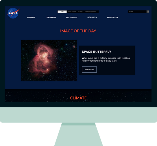
Most test participants were able to complete the tasks. However, there was a prototype error in the image carousel, causing one user to only view 2 out of the 4 slides.
Tasks

Feedback

Adjust alignment of Newsfeed in main navigation.
Fix prototype connections in image carousel.

Adjust spacing between cards in the Climate section.

Make font in footer smaller and lighter.


Final Thoughts
UI analysis and information architecture are key parts of the redesign process. It is crucial to find issues related to navigation, content structure/hierarchy, and design elements prior to creating a prototype. Based on the Usability Tests at the end of the project, I believe my partner and I successfully reorganized the navigation and structure of the site as users were able to successfully find information in the navigation and body of the website.
If there were more time for this project, I would like to add pages under the Missions and Galleries sections, add an educational resources section on the homepage and reformat the Latest in Space Tech section so that it horizontally scrolls (mobile version).
Thank you!
